Pie Chart Layer
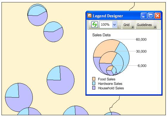
A pie chart layer contains an object theme that enables you to examine more than one variable per record at a time. Like comparing the height of the bars in bar charts, in pie charts you compare the wedges in a single pie, or examine a particular wedge across all pies. Pie charts enable you to compare parts of a whole.
Both pie and bar charts are particularly useful for analyzing demographic data. For example, you have a table of demographic information for the United States. Your table shows the populations of several major demographic groups. Using pie charts, you can show the population of each demographic group, and see what fraction of the pie it makes up in each pie. This enables you to see the distribution of demographic groups on a per state basis, or across the entire United States. You can also look at one demographic group and see how the population of the group varies in different states. For best results, use no more than four to six pie wedges per pie chart in your analysis. To ensure the order of categories in this type of chart, use an ORDER BY clause in the query that defines the underlying table.
