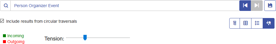
Chart View
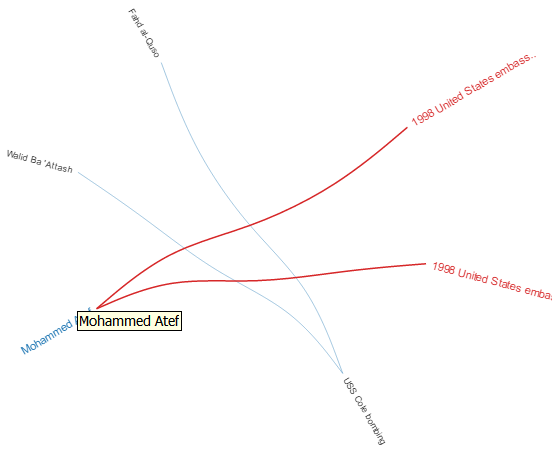
Similar to the chart in the Tree View and Column View, the Chart View presents query results in a more graphic manner than the other views. We use the same query, which looks for people who organized the events leading up to and including September 11, 2001; three names and three events were returned.
You can see on the top-right portion of the screen that green lines represent incoming relationships and red lines represent outgoing relationships. To view these relationships. you must hover over one of the names or events in the chart. For our example we hovered over Mohammed Atef, and in these results he has two outgoing relationships, as depicted by the two red lines.
On the top-left portion of the screen, you can see in the red box a sliding Tension control. This enables you to designate how tight or loose the connections are between entities.
You can also rotate the image. If you hover the cursor between two of the names, you will see it turn into a four-sided arrow. Drag your the cursor in any direction to see the image rotate.