
Changing User Interface Colors
The brand.css file controls the look and feel of user interface elements, such as buttons, lists, and tables. There are instructions within the brand.css file that explain how to customize each property shown below.
| Search brand.css for | Example | |
|---|---|---|
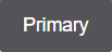
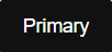
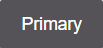
| Primary Button | ||
| Normal | btn-primary |
 |
| On hover over | btn-primary:hover |
 |
| On focus state | btn-primary:active |
 |
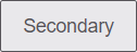
| Default Button | ||
| Normal | btn-default |
 |
| On hover over | btn-default:hover |
 |
| On focus state | btn-default:active |
 |
| Link Button | ||
| Normal | btn-link |
 |
| On hover over | btn-link.nostyle:hover |
 |
| On focus state | btn-link:focus |
 |
| Forms | ||
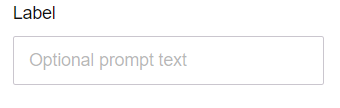
| Text field | form-control |
 |
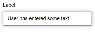
| Text field active state | form-control:focus |
 |
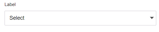
| Text drop-down list | ui-select-multiple |
 |
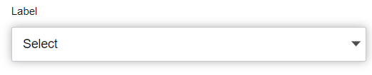
| Text drop-down list active state | ui-select-match>.btn:hover |
 |
| Lists | ||
list-group-item |
 |
|
| Tables | ||
table
|
 |
|
| Token or Badge Color | ||
badge-brand-info |
 |
|
| Annotation Color | ||
svg-brand.draw-annotation |
 |
|
| Tabs | ||
| Active state | nav-tabs
|
 |
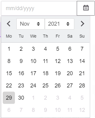
| Date Picker | ||
_720kb-datepicker-calendar |
 |
|
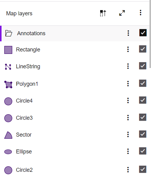
Checkbox on layer panel - To change the color of a checkbox on the layer panel, change the
color in the |
||
.pbi-check-square {color: #565358!
!important;} |
||
Background-color of label tag - To change background-color of label tag on layer panel,
change the background-color in the |
||
.activeTag {background-color: #565358!
!important;} |
||