Data Visualization Tools
The Discovery Center includes data visualization charts, graphs, and tables that give you overviews of the structure and content of your data sources and attributes. These graphical tools provide at-a-glance insight into potential data problems that you may need to investigate further. When you open a data source, the visualization tools described here are available from the Summary and Attribute Details tabs. You drill down from analysis results, statistics, and summaries to view details of data values in rows and attributes.
If the data source is dynamic, a subset of metadata is available. The following charts are only available for profiled (fully loaded) data sources:
■ Relationships (joins, dependencies, and keys)
■ Attribute Completeness (nulls, duplicates, unique values)
■ Values (completeness, range, frequency)
■ Patterns and Structure
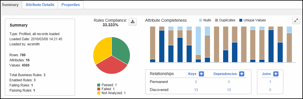
Data Source Summary
| Chart | Description | |||||||||
|---|---|---|---|---|---|---|---|---|---|---|
|
Rules Compliance % |
Color-coded pie chart that illustrates analysis compliance for all rules in the data source. The pie chart includes up to six sections. Each section corresponds with one of six potential rule statuses, including passed, failed, not analyzed, no rows, errored, and disabled. Note the following: ■ Hover over a section to see the percentage of total rules with that status. ■ Double-click a section of the pie chart to open a tab showing the filtered results for rules with that status. For example, click the Passed (green) section of the chart to open the Passing Business Rules tab to see details about all business rules in the data source that passed data analysis. ■ The legend below the chart shows the number of rules for each status. Click a status in the legend to temporarily remove the corresponding section from the chart. This is helpful to view other sections more clearly. Click the legend status again to restore the sections. ■ To download a copy of the pie chart and legend information, click the chart download button (
|
|||||||||
|
Attribute Completeness |
Color-coded bar chart that shows the number of null, duplicate, and unique values in each attribute in the data source. Each bar color represents a percentage of the values found. Note the following: ■ Hover over a bar to see the attribute's name and the value counts. ■ Click the Nulls, Duplicates, or Unique Values title to remove the associated sections from the chart. This is helpful to view other sections more clearly. Click the title again to restore the charts. ■ The chart shows up to 30 attributes, in the order they appear in the data source. If there are over 30 attributes in the data source, click the Next arrow to the right of the chart to show more attributes. Click the Prev arrow to the left of the chart to see the 30 previous attributes. ■ To zoom in on the bar chart, do one of the following:
■ Double-click a bar to toggle the view to the Attribute Details tab, highlighting the selected attribute. A tab showing additional attribute metadata also opens.
|
|||||||||
|
Relationships |
Table that shows the number of permanent and discovered keys, dependencies, and joins across all attributes in the data source. Drill down to see the relationship values and associated metadata, view join Venn Diagrams, change the status, and delete the relationship if no longer valid. For more information, see Data Relationships. To create or discover a relationship, click the Keys, Dependencies, or Joins plus button
|
 ). Save the chart as a PDF document or a PNG, Scalable Vector Graphics (SVG), or JPEG image file.
  ) to restore the bar chart.
  ). The chart expands to fill the Data Source Summary tab. This allows you to better see each bar in a larger size. Click the Zoom out icon (
 ) to restore the bar chart. To see details of one or more bars, click and drag a highlight box over the bars.
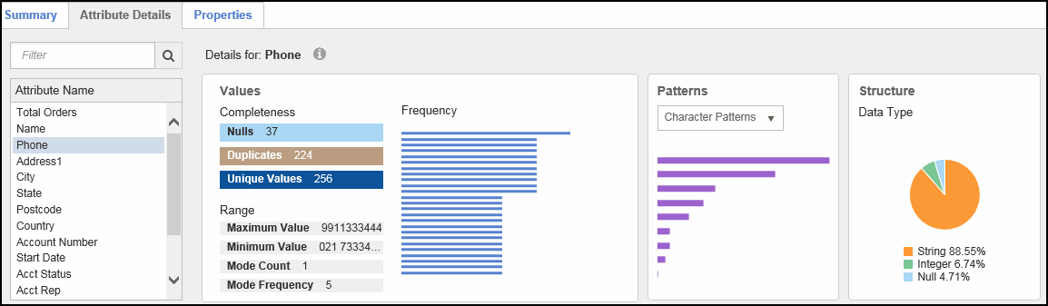
 Attribute Details
| Chart | Description | ||||||||||||
|---|---|---|---|---|---|---|---|---|---|---|---|---|---|
|
Values |
Tables and charts that show the completeness, range, and frequency of values in the selected attribute. ■ The Completeness table shows the number of null, duplicate, and unique values in the attribute. ■ The Range table shows how the data in the attribute is distributed across the range of string or numeric values. The range consists of the minimum value, maximum value, mode count ■ The Frequency bar charts shows how frequently each value in the attribute occurs, in descending order from most frequent. Up to 25 bars display. Hover over a bar to see the value and value count. Double-click a bar to open a tab showing the associated attribute data rows for the value.
|
||||||||||||
|
Patterns |
Bar charts that show the frequency at which character patterns, masks, metaphones, and soundexes occur in the attribute, in descending order from most frequent. Note the following:
|
||||||||||||
|
Structure |
Pie chart that shows the attribute's inferred data type information
|