Applies to:
- Winshuttle Foundation
Selectable Table
A selectable table enables form users to select a row of data from the table and then use it to populate other fields within the form. In addition, you can apply Rules to a selectable table when a row is selected.
Selectable Table General Properties
| Name | The table ID in the form |
| Rules | Click to view, add, or edit Rule(s) which will be run when a row is selected from the table. See Working with Rules for more information. |
| Column Span | The width of the column relative to the other columns in the table. |
| Show Header |
|
| Row Count | The number of rows before paginating content. |
| Displayed Rows | The number of rows to display at one time. |
| Row Number Field | Select a field to use as the row number for the table. |
| Row Details |
Provides on-demand access to table content. The content will be hidden until the Show Details context menu option is selected, at which time a dialog will appear with all the content of the “Row Details” property. This property contains all the labels and fields that will be displayed (read only) at run-time with the Show Details menu option. This can be useful for providing secondary information, reducing the amount of table data when the form loads, and improving the overall layout and performance of the form. |
| Enable Search |
Enable or disable a search box for searching or filtering information in a table.
|
| Enable Sort |
|
| Paginate Content | Set to True to have results paginated (good if you expect large amounts of data returned). |
| Save Content | Set to True, this setting preserves the content in the formXML when the form is saved. |
| Border Width | The width in pixels of the border around the group. |
| Border Style | The style of the border--dashed, dotted, solid, etc. |
| Border Color | The color of the border. |
Advanced Options
Key Column for Merging: This dropdown will contain a list of all fields contained in the Repeating Table / Repeating Group. Setting this 'key' will cause the form to perform a merge each time the table data gets updated, but only fields that are actually changed by the user are updated.
The value of the key should be the name of one of the table columns . Each row must have a unique key value. The key value indicates which column contains the key (for example, my:partnumber).
Payload Store Type: Where to store external data. If you are working in an environment where an external data store has been configured to offload part of your form data, the values in this dropdown let you specify which 'store' to use. (This would need to be configured by your Winshuttle Workflow Administrator.)
Tip for querying a SQL data source: Case matters.
If you are querying a SQL data source and then want to insert results into a selectable or repeating table, make sure that your query text matches the case of the SQL columns.
For example, if a column in the SQL database is COLUMN_1, then the Query will not work if it is querying column_1.
Adding and configuring a selectable table

- In the canvas, click the group to which you want to add a table.
- In the Properties pane, click the Elements tab.
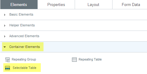
- click Container Elements.
- click Selectable Table.
- In the New Selectable Table dialog box, type the number of columns you want, and then click OK.
