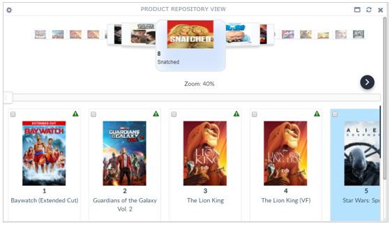
Repository View Widget
The Repository View widget displays the selected repository in the widget, in the same form as a Repository View Tab.

Configuring the Repository View Widget
To configure a Repository View widget:
-
Configure a new blank widget. For more information about adding and configuring new widgets, see Add a Widget.
-
Select the Settings icon
 in the upper right of the new widget’s Activity Bar. Note that a widget’s
Activity Bar will not be displayed unless the cursor is hovering over the top of the
widget. A Configuration window will appear.
 - Select Repository View from the Type dropdown list on the far right of the widget Configuration window. The Repository View widget configuration options will appear.
- Edit the Repository View configuration options as desired.
-
Title: The title of the widget. It is helpful if the title of a widget reflects the source of the data as well as the widget’s type, for example "Product Staging Repository View".
-
Repository: Select the repository to be viewed.
-
Preference: (Optional) Select a Preference to use (what fields to show in the widget). If a Preference is not selected, the Default Preference will be used.
-
Saved Search: (Optional) Select a Saved Search to use.
-
Number of Records Per Page: The number of records to be displayed on a page. This field only is active if the Data-Pager options has been enabled.
-
Cover-flow: (Either Cover-flow or Grid View must be checked.) If checked, the Cover Flow function will be enabled. Cover Flow is a series of record images that appear above the attribute headers in a Repository View. The images can be scrolled through and can enlarged or reduced by sliding the Zoom slider beneath the images.
-
Grid View: (Either Cover-flow or Grid View must be checked.) If checked, the Repository View will be displayed in the Grid View. If not checked, no repository records will be displayed.
-
Breadcrumb – Filters: (Optional) This widget allows filtering the records show by column values. If Breadcrumb – Filters is set, the Breadcrumb Filter Bar will appear and show all active filters.
-
Data-Pager: (Optional) If checked, the paging controls will appear at the bottom of the widget display area, otherwise, only the first page of the repository will be shown.
-
Allow Open: (Optional) If checked, a record can be opened to edit from the widget.
-
Allow Save and Send: (Optional) If checked, selected records can be saved and sent to Workflow from the widget.
-
Auto Reload: (Optional) If checked, the record list will be automatically be refreshed when changes are made to the repository.
-
-
Click Apply to save the changes to the widget and close the Configuration window. Click Cancel to close the Configuration window without saving the changes.
-
If you want your Dashboard configuration to remain after you switch tabs or log out, click the Save Layout button on the Dashboard's Activity Bar, otherwise your Dashboard will revert to its last saved configuration.
